
Alternate Designs:


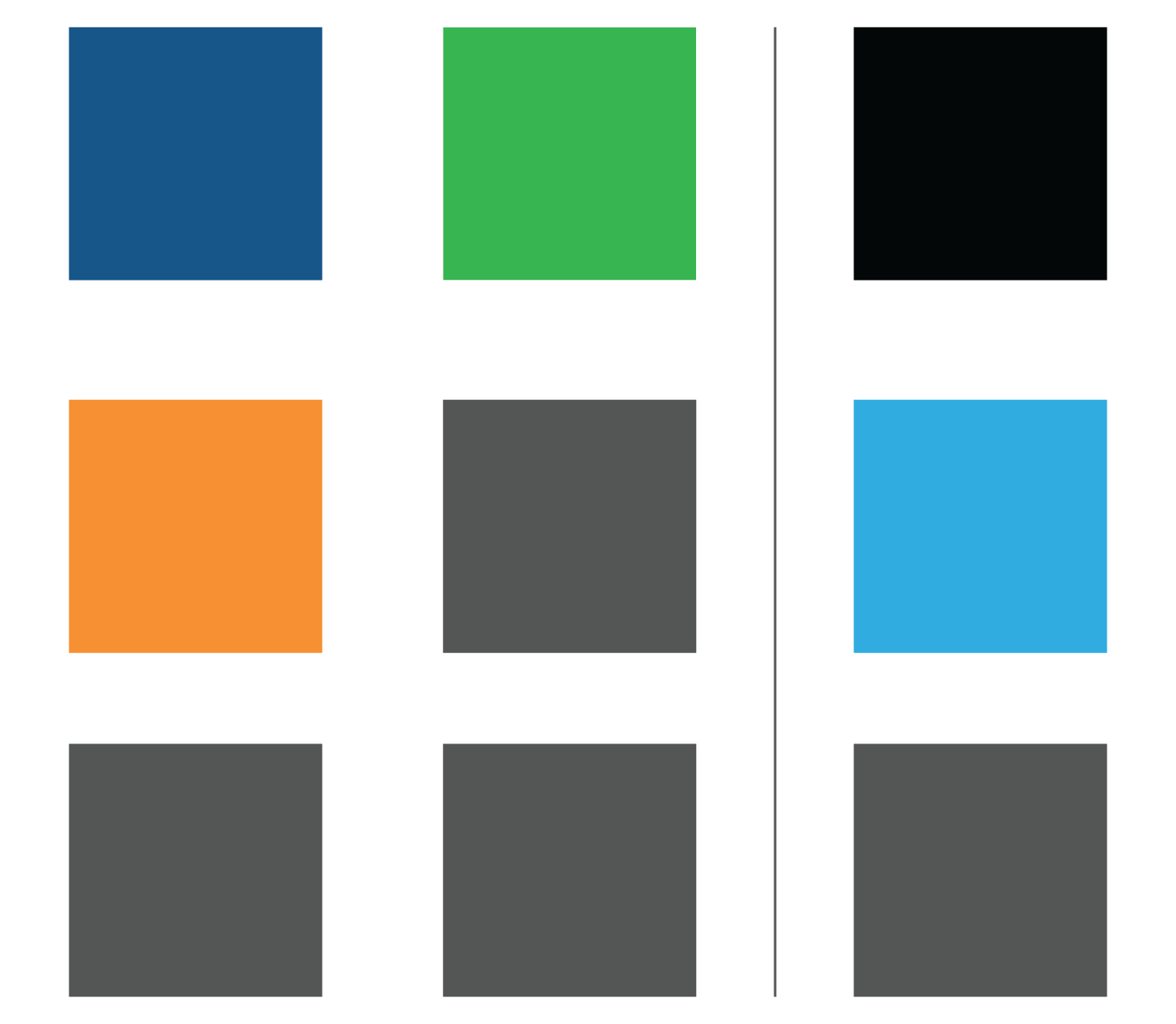
Color Options:

In the summer of 2017, I was approached to create a rebranding of the workforce management software company Reflexis Systems. The old logo had been in use since the company's founding, and the complex gradients and lack of scalability were making it cumbursome in a 21st century tech environment.
The brand wanted a simple, modern logo which illustrated their commitment to their customers. The options explored included symbols of the shopping industry before landing on a representative person in the 'i' and a shopping bag holding the R. Social iconography was important to the rebrand so each design contained a signature element for profile images.
The client chose not to rebrand at the current time.


