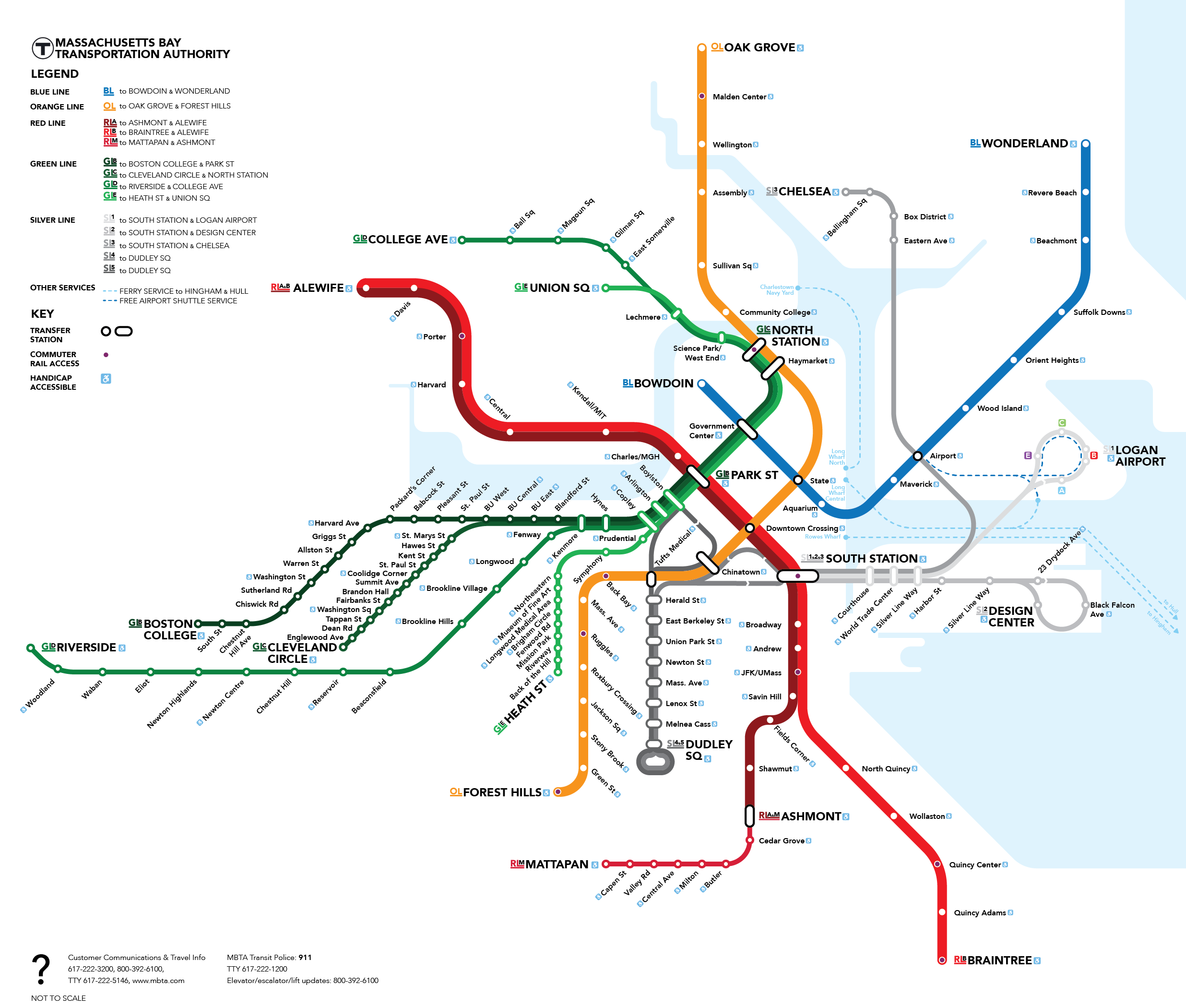
For years I have wasted away the hours trying to create a viable alternative to the current (and past) MBTA subway map for the city of Boston. The goal being to develop a map that keeps the iconic character of the original system map while updating it for better legibility and creating cleaner, more modern design standards for the system.
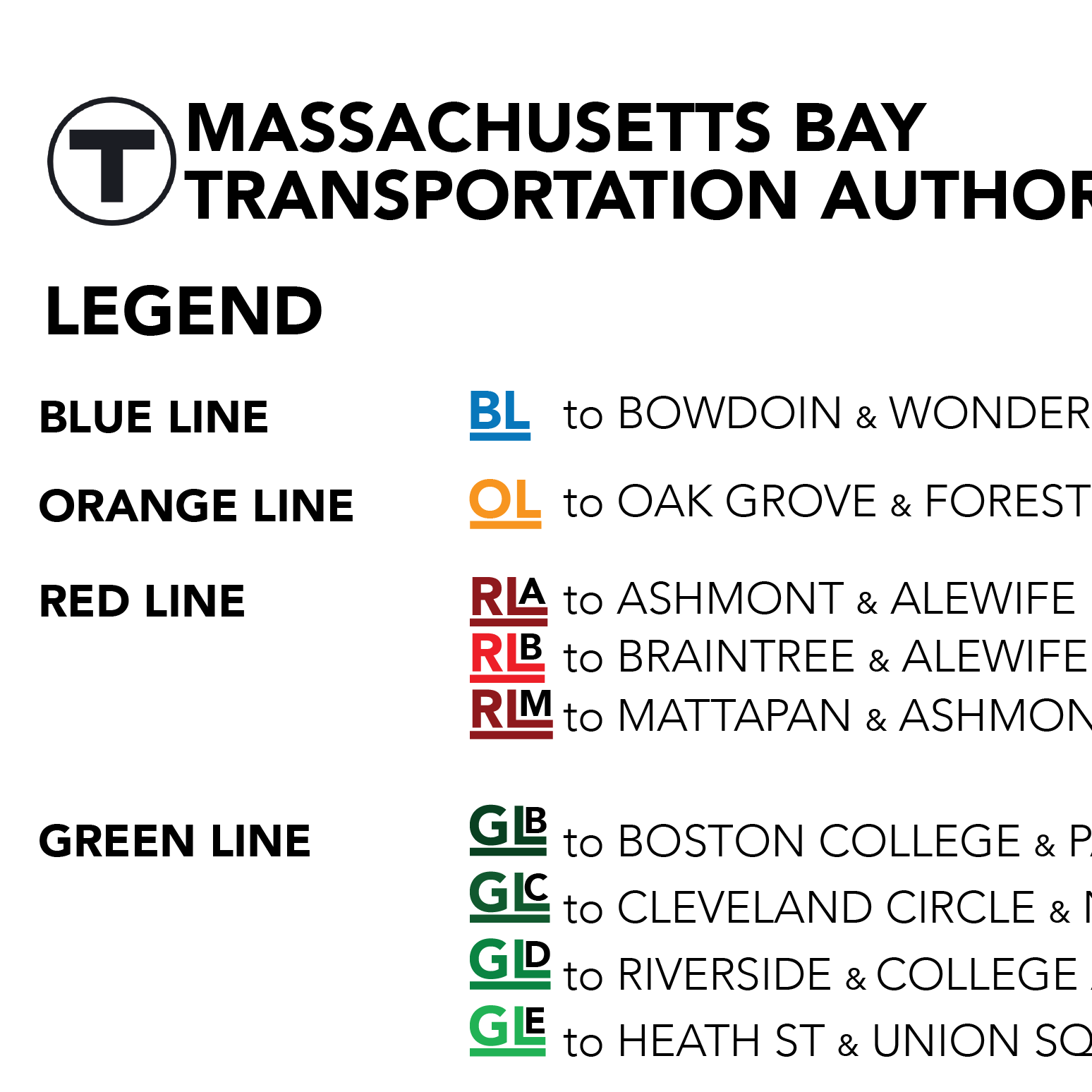
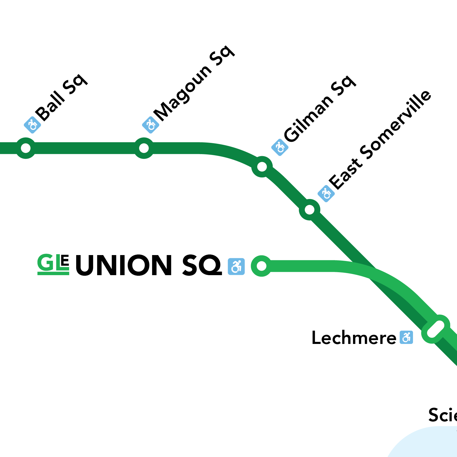
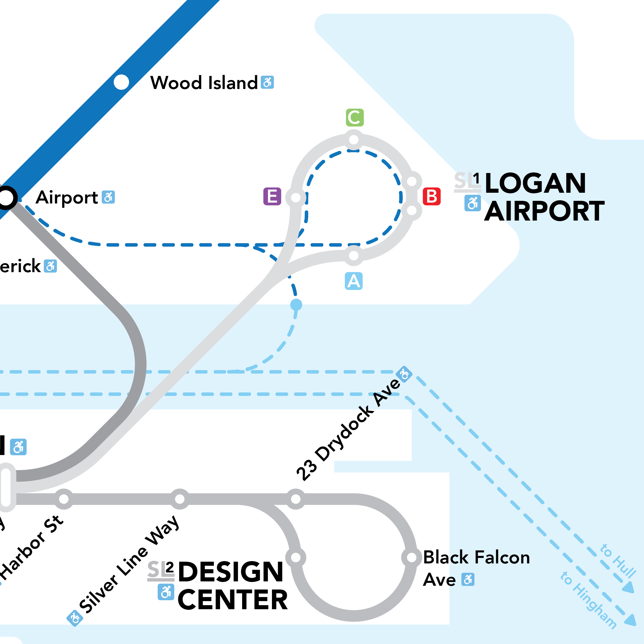
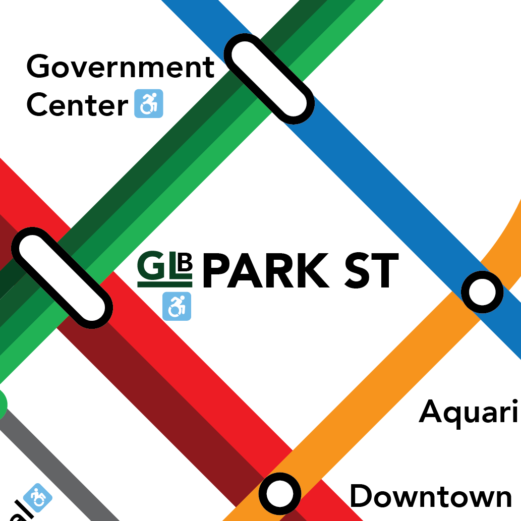
The most noticeable change is the separation of lines into different branches on the red, green, and silver lines. Earlier designs used a single line to represent multiple routes with differing terminating stops, leaving commuters lost and confused. I've seen many a rider sit and wait for a train to Park St at Kenmore only to let Government Center and and North Station trains go flying by.
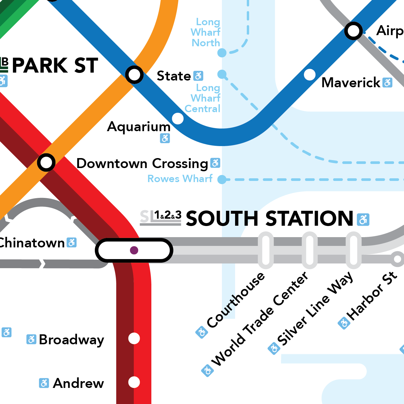
I also took great care in simplifying the language of the map. The current waterfront map is jagged and confusing. It leaves out important details like the Fort Point Channel while including pieces farther out that aren't as directly applicable to the transit system. By cleaning it up and dramatically simplifying it, the geographic markers become more apparent and there is less visual noise to distract a viewer.